

Brand identity
Kime Studios
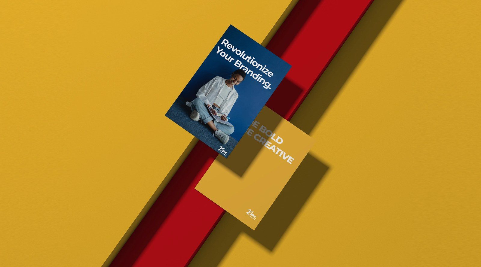
A minimalist studio identity where colour does the talking.

The brief
Kime Studios needed a mark that could hold a room and a business card. We built the identity on colour discipline and one confident letterform.
The idea
Pick one colour and own it. Everything else gets quieter so the brand gets louder.
The problem
Minimal identities often read as empty rather than restrained.
The brand had to feel considered across print and digital.
What we did
- A single-colour system with strict application rules
- Typography with a distinct voice at every size
- Simple product applications that make the brand feel real