

Brand & packaging / QSR
Negroni
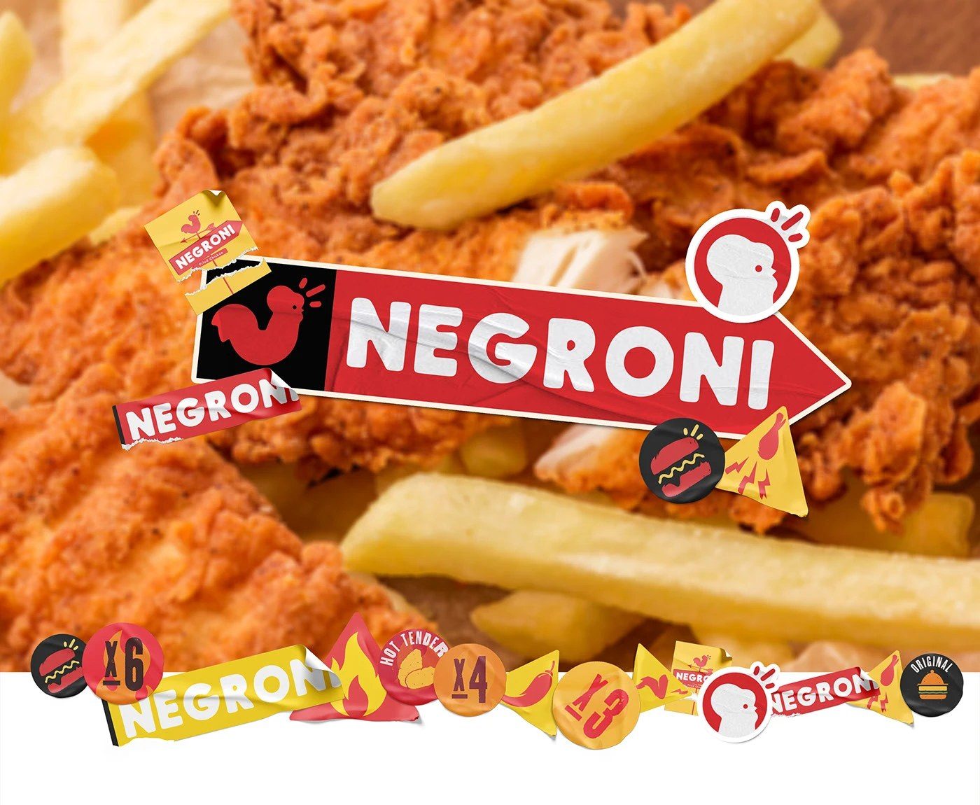
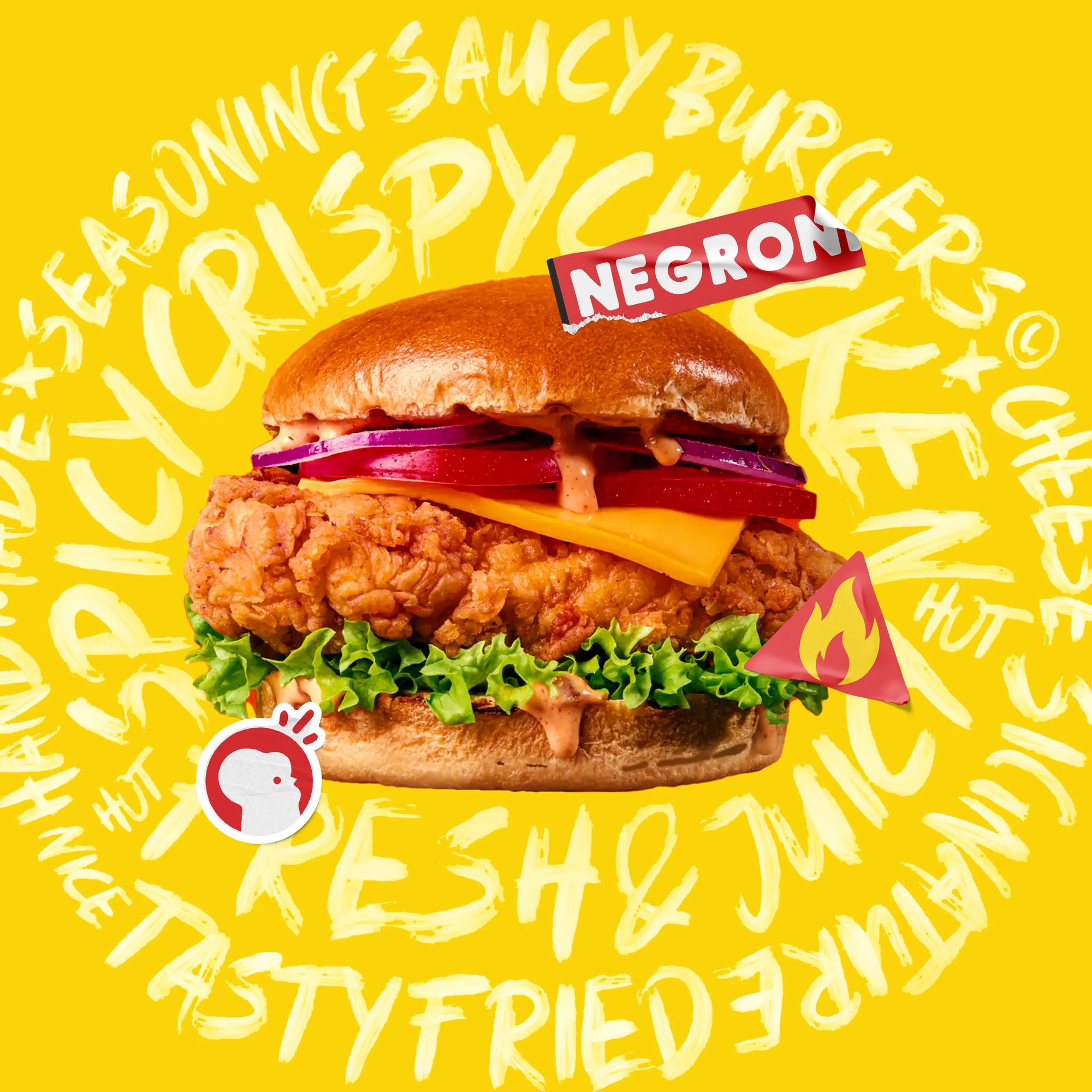
Loud, appetising and unapologetically playful fried chicken branding.
The brief
Negroni is fried chicken with a personality problem, in the best possible way. We built a maximalist brand system: bold shapes, flat colour, zero apologies.
The idea
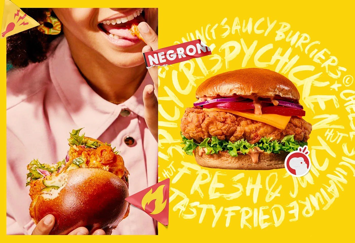
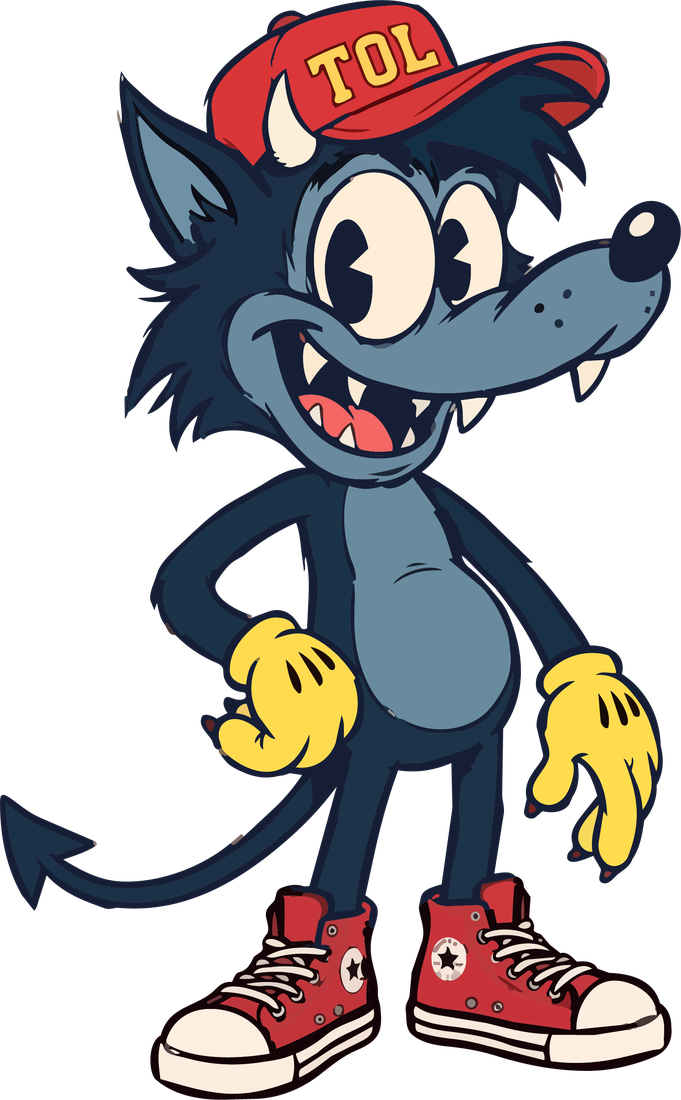
Cartoon confidence. The brand behaves like a character, which makes it instantly recognisable from across the street.
The problem
Fast food branding defaults to noise without meaning.
Packaging has to perform hot, fast and greasy.
What we did
- A bold pop-art identity built for packaging speed
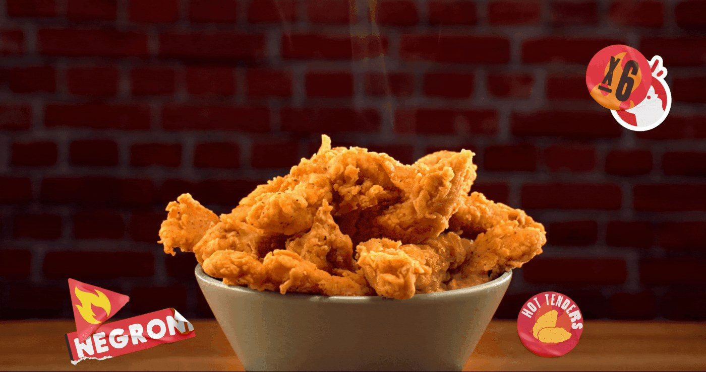
- Menu and delivery assets that read in a single glance
- A campaign tone that stays playful without becoming a gimmick