


Streetwear / brand & art direction
ONDO
Streetwear with a gritty digital edge and no interest in looking polite.
The brief
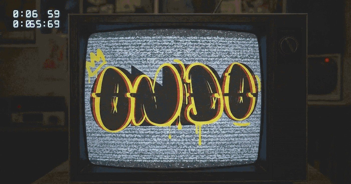
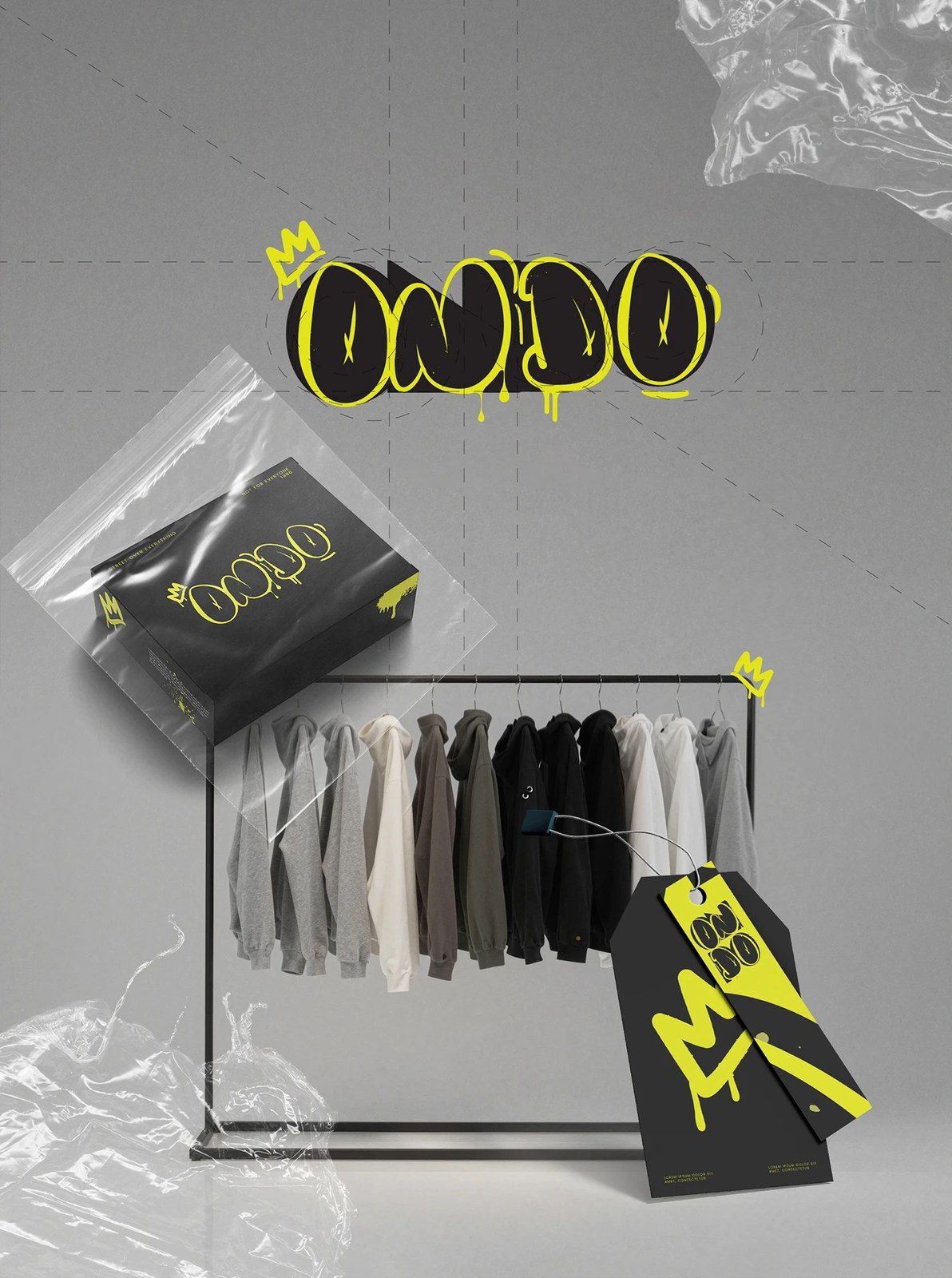
ONDO is a streetwear label built for people who read the tag twice. The identity is raw on purpose: hardware graphics, monitors, barcodes and type used as texture.
The idea
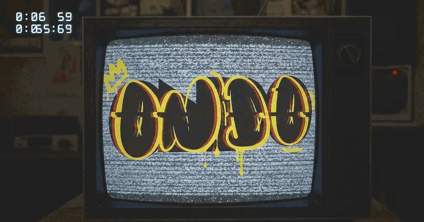
Build the brand like a signal, borrowed from old screens, and let the noise be the statement.
The problem
Streetwear branding moves fast and dates quickly.
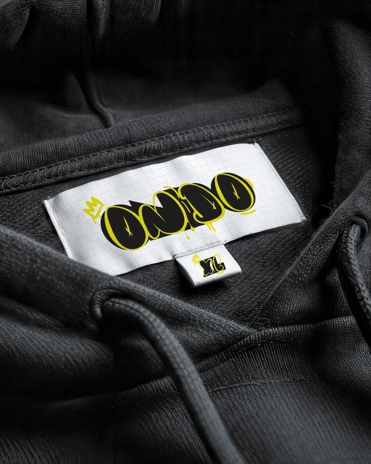
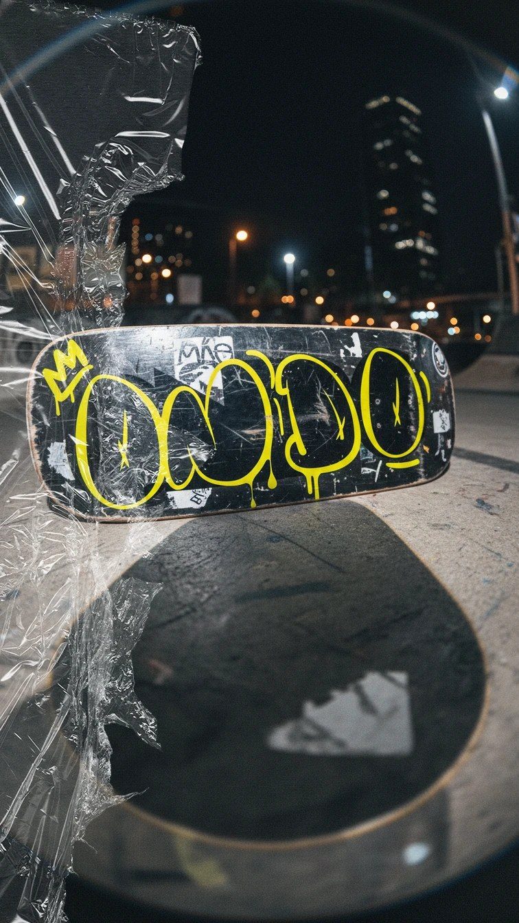
The identity had to work on garment, screen and concrete.
What we did
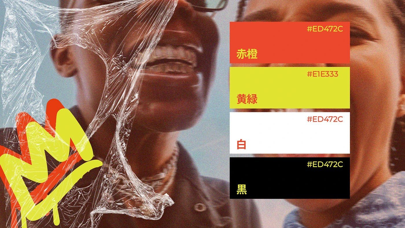
- A graphic system built from hardware and barcode motifs
- Type guidance that holds from embroidery to billboard
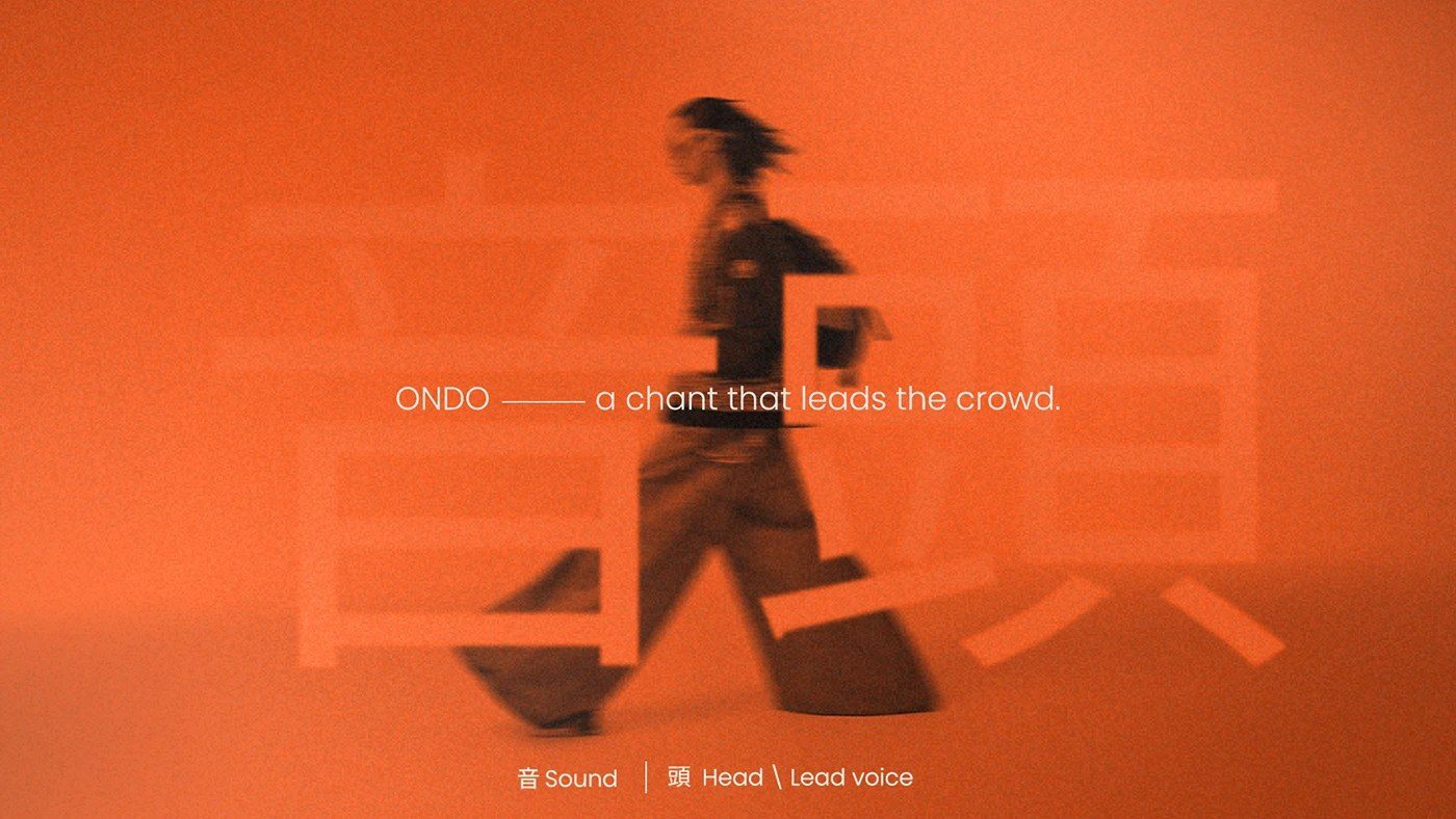
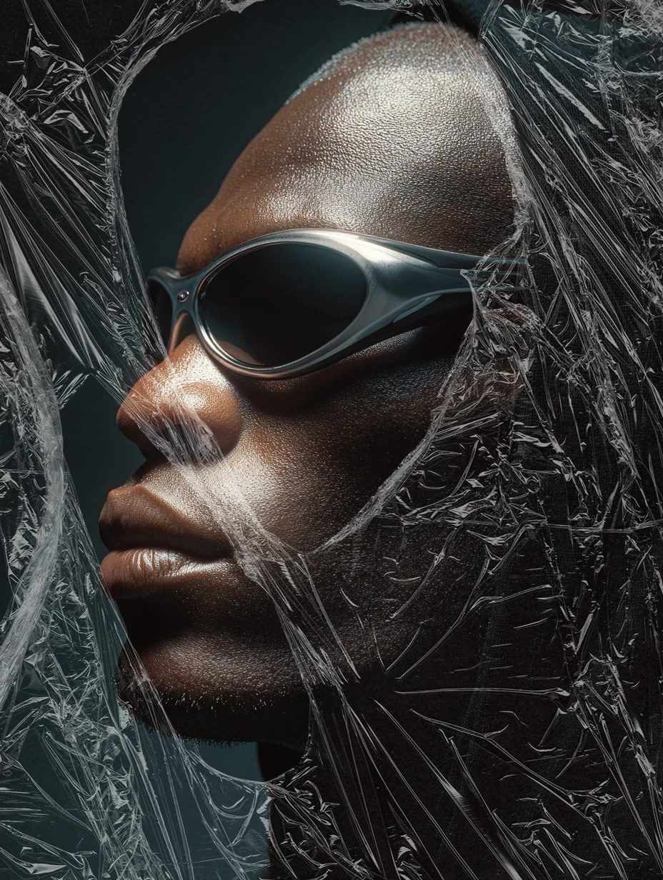
- Campaign art direction that keeps the attitude consistent